
The Roots feat. Big K.R.I.T. – Make My


One of the most important aspects when it comes to the branding of a company has to be the logo. A company’s logo is often the first visual impression of the company and you absolutely do not want to fuck up that first impression. Fucking up your logo is the equivalent of trying to talk to a chick with that nasty white shit in the corner of your mouth… Well may be not that bad but you get what Im saying. A LOGO IS SOMETHING YOU DON”T WANT TO FUCK UP.
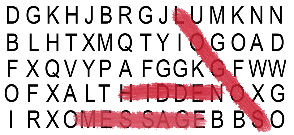
Some of the best logos are the ones that deliver a message to the potential consumer indirectly. When companies deliver a message to potential consumers indirectly, theres a stronger connection to the brand vs. the brand forcing a message down the consumers throat. Its the equivalent of observing a girl and recognizing she’s fly without anything being said vs. the girl telling you how fly and awesome she is.
Checkout a few dope logos that pulled off the hidden message pretty well:

The Amazon logo is an extremely simple logo and while the arrow may just look like a smile it actually points from a to z. This represents that Amazon sell everything from a to z and the smile on the customers face when they bought a product.

Big Ten is an academic union which was founded in the year 1896. Until 1990, this union consisted of 10 universities, but in June 1990 Pennsylvania State University was added. They didn’t want to change their name, so they added the number 11 to the logo.
![]()
The FedEx logo look like a plain text based logo but if you take a second look between the E and the x you will see an arrows which represents the speed and accuracy of the companies deliveries.

Sony Vaio is a well known brand of laptops. But did you know that the name Vaio logo also had a hidden meaning? Well, the first two letters represent the basic analogue signal. The last two letters look like a 1 and 0, representing the digital signal.
![]()
Continental is a manufacturer of tires. You could actually see this in their logo, because the first two letters create a 3-dimensional tire.
![]()
The Chick-fil-a logo incorporates a chicken into the C. Although this isn’t very hidden, it is still very clever.

The Baskin Robbins logo may look like it includes a simple BR above the name but if you take another look you will that it includes a pink number 31. This is a reference to the original 31 flavors.


Facebook is by far the the most progressive invention of our life time. It has exploded way further then I thought it would when I first started using it during college in 2005. To be honest Facebook dictates a large part of my life, from how I communicate with friends to how I receive news. Jean-Jacques Parys (a college student) breaks down just how instrumental Facebook is in a lot of our lives. Check the Infrographic Video below:
Facebook Infographic from Jean-Jacques Parys on Vimeo.
